2026 Interior Paint Trends for Sarasota Homes
Interior Painting, Sarasota FL, 2026 Color Trends
2026 Interior Paint Color Trends: The Best Colors for Sarasota Homes
Sarasota homeowners are rethinking their interiors for 2026, and the message is clear: stark white boxes are out, and warm, livable color is in. With nearly 60% of homeowners planning interior paint projects and almost half saying bright white rooms are their biggest design “ick,” the timing has never been better to refresh your space with colors that truly fit our coastal Florida lifestyle. This guide breaks down the top 2026 interior paint color trends and the best shades for Sarasota’s light, architecture, and way of life—so you can choose like a pro and love your home in every season.
Why 2026 Color Trends Feel So Right for Sarasota Homes
National color forecasts for 2026 are surprisingly aligned with what works best in Sarasota. Paint brands and design editors are leaning into warm neutrals, earthy tones, and nature-inspired greens and blue-greens that create calm, restorative interiors. Behr’s Hidden Gem, a smoky jade-blue-green, and Valspar’s Warm Eucalyptus, a soft earthy sage, are standout Colors of the Year that echo our Gulf waters and lush landscaping (paintcolorproject.com, paintcorps.com).
At the same time, nationwide, designers report that cool grays are fading fast. Those icy, blue-leaning grays that dominated the 2010s can feel cold and flat in Sarasota’s abundant sunshine. Instead, 2026 brings a softer, more inviting palette that pairs beautifully with our white trim, light tile, and indoor–outdoor floor plans. If you’ve been waiting for the right moment to move past gray and bright white, this is it.
From Stark White to “Comfortcore”: What Homeowners Want Now
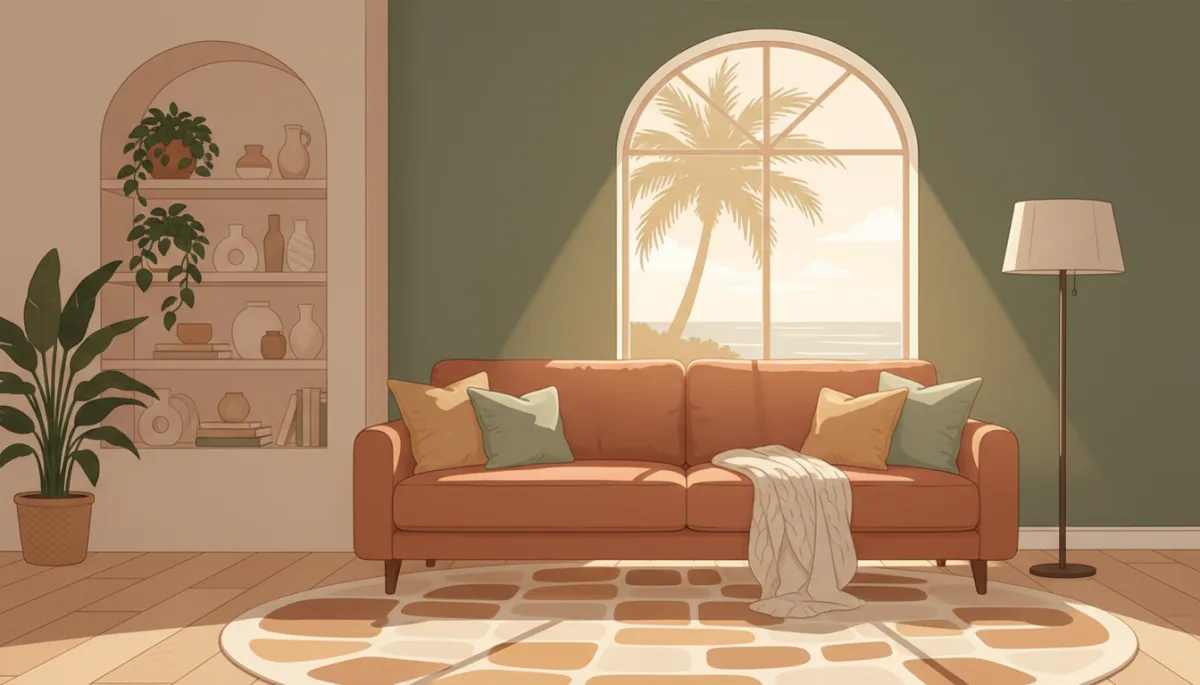
One of the biggest buzzwords in 2026 paint trends is “comfortcore.” This style is all about creating spaces that feel soft, welcoming, and lived-in rather than staged or sterile. Instead of harsh gallery white, homeowners are choosing warm neutrals with subtle undertones—colors that still read light and airy but have a touch of cream, beige, peach, or blush to them. Nationally, these are the most searched and most approved colors heading into 2026, with cool grays and stark whites rapidly losing favor (Lightmenpainting, homesandgardens.com).
In a Sarasota home, comfortcore translates beautifully. Our bright sun can make pure white walls feel glaring and clinical, especially in open-concept spaces with tile or LVP floors. Warm, layered neutrals diffuse that brightness, soften shadows, and make rooms feel more intimate—without ever feeling dark or heavy. Think of it as “resort calm” instead of “rental white.”
💡 Local Pro Tip: If your current white feels too stark, shifting just one or two steps warmer on the color strip can instantly make your Sarasota home feel more expensive and more comfortable, especially in south- and west-facing rooms.
Warm Neutrals: The New Foundation for Sarasota Interiors
Warm neutrals are the backbone of 2026 interior paint color trends. Instead of flat beige, today’s neutrals have complex undertones—sand, almond, mushroom, or even a whisper of pink or terracotta—that add depth and sophistication. Sherwin-Williams’ Universal Khaki, for example, is a top 2026 neutral, praised for its soft, sun-baked look that feels right at home in bright climates (paintcolorproject.com, powersrealty.com).
Best Warm Neutrals for Sarasota Homes
Sandy Creams: Perfect for main living areas, these mimic our Gulf beaches and look beautiful with white trim, rattan, and light oak furniture. They keep rooms bright but never stark.
Greiges with Warm Undertones: Greige is still popular, but in 2026 the winning shades lean beige rather than cool gray. They work especially well in homes with both white and wood cabinetry.
Red-Toned Taupes: Editors note that red-based taupes are gaining ground as modern, earthy neutrals (homesandgardens.com). In Sarasota, these are ideal for dining rooms, home offices, or bedrooms where you want a cozy, enveloping feel without going dark.
When Edwin and his team plan interior projects locally, these warm neutrals are often the starting point. They create a cohesive canvas that lets you layer in coastal blues, woven textures, and artwork without the room feeling busy. They also photograph beautifully for real estate listings, which is a bonus if you might sell in the next few years.
Earthy Tones: Bringing Sarasota’s Outdoors Inside
Beyond neutrals, 2026 is all about earthy tones—colors that feel pulled from nature: terracotta, clay, driftwood brown, soft ochre, and rich mahogany. Straightline Home Repairs highlights earthy reds, terracotta, and burgundy as rising stars for 2026 (straightlinehomerepairs.com), while other forecasts spotlight warm browns and soft ochres like C2 Paint’s Epernay (powersrealty.com).
In Sarasota, these tones shine as accent colors rather than full-house choices. Our strong natural light can make deep shades feel lighter and more approachable, especially when they’re paired with warm neutrals and white trim. Used thoughtfully, earthy colors add character and a custom, designer look to otherwise simple spaces.
Where to Use Earthy Tones in a Sarasota Home
Terracotta & Clay: Beautiful on a single accent wall behind a bed, in a breakfast nook, or on a kitchen island. These colors pair well with white quartz, black hardware, and natural wood shelves.
Driftwood Browns: Great for media rooms, offices, and dens where you want a grounded, relaxed vibe. They echo the look of weathered dock wood and coastal boardwalks.
Warm Mahogany & Burgundy: Glidden’s Warm Mahogany and similar tones bring a sophisticated, club-like feel to dining rooms or entryways (paintcolorproject.com). In Sarasota, they’re especially striking paired with creamy walls and brushed brass lighting.

A terracotta accent wall adds depth and warmth without overpowering coastal light.
Blue-Greens and Sage: Sarasota’s New “Coastal Neutrals”
One of the biggest national trends for 2026 is the rise of soft, nature-inspired greens and blue-greens. Shades like sage, eucalyptus, and smoky jade are being called the “new neutrals,” offering subtle color while still feeling calm and versatile (paintcorps.com, livingetc.com). Behr’s Hidden Gem and Valspar’s Warm Eucalyptus are perfect examples—muted, elegant, and incredibly livable.
Sarasota’s coastal setting makes these hues especially appropriate. Instead of the bright turquoise and navy stripes of traditional “beachy” décor, 2026 favors muted coastal colors that feel more high-end. Think sea glass, eucalyptus leaves, and the horizon at dusk rather than tourist-shop teal. These colors create a seamless transition between your views outside and your spaces inside (tannerre.com, estatepainting.com).
Best Uses for Blue-Greens and Sage in Sarasota
Bedrooms & Guest Rooms: Soft sage or eucalyptus creates a spa-like retreat, especially when paired with linen bedding and woven shades. These hues look gorgeous in morning and evening light.
Bathrooms: Smoky blue-greens like Hidden Gem bring a boutique-hotel feel to small spaces without overwhelming them. They pair beautifully with white tile and brushed nickel fixtures (tandjpaintingfl.com).
Cabinetry & Built-Ins: Painting lower kitchen cabinets, laundry room cabinets, or living room built-ins in a muted jade or sage is a very 2026 way to add color. Against warm neutral walls, the effect is rich but calm.
💡 Edwin’s Advice: In Sarasota’s bright sun, always test blue-greens on multiple walls. Some can shift more blue or more green depending on your exposure. A professional painter can help you narrow down undertones before you commit.
Soft Pastels and Romantic Tones for Cozy, Coastal Comfort
Alongside earthy colors and blue-greens, 2026 brings a wave of soft pastels and romantic tones—dusty rose, mauve, lilac, and warm peach. These aren’t the sugary pastels of children’s rooms; they’re muted, grown-up shades that add warmth and personality while still feeling sophisticated (columbiapaintco.com, marthastewart.com).
In a Sarasota home, these colors are particularly lovely in:
Primary Bedrooms: Warm blush or mauve creates a cocooning feel that still works with white bedding and light furniture.
Nurseries & Guest Suites: Soft peach or dusty rose feels welcoming and flattering on skin tones—great for spaces where you want visitors to feel instantly at ease.
Reading Corners & Sitting Rooms: Pair a romantic wall color with a comfortable chair, floor lamp, and layered textiles for a true comfortcore corner.
Why Cool Grays Are Fading Fast in Sarasota
For years, cool gray was the default choice for “modern” interiors. But by 2026, both designers and homeowners agree: cool grays are fading fast. In bright, sun-filled markets like Sarasota, the reasons are clear. Icy grays can:
Make rooms feel flat or shadowy in strong natural light
Clash with warm-toned flooring, wood furniture, and cream countertops
Read as cold or even slightly blue in photos and at night
That doesn’t mean you have to abandon gray entirely. The 2026 update is to choose warm grays and greiges that lean beige or taupe instead of blue. These “bridge” colors are far more forgiving with existing finishes and work beautifully with the warm neutrals and earthy accents dominating current trends (homesandgardens.com, paintcolorproject.com).
📌 Key Takeaway: If your Sarasota home is still painted in a cool, blue-based gray, shifting to a warm greige or sandy neutral will instantly modernize your interior and align it with 2026 trends—without requiring new furniture or flooring.
Room-by-Room: The Best 2026 Colors for Sarasota Homes
Living Rooms & Great Rooms
For open-concept spaces, Edwin often recommends a warm, light neutral as the main wall color: sandy cream, warm greige, or a soft khaki similar to Universal Khaki. These tones:
Keep the room feeling airy in Sarasota’s bright daylight
Work with both cool and warm décor, so you can change pillows and rugs over time
Provide the perfect backdrop for blue-green, terracotta, or coastal artwork accents
Kitchens & Dining Areas
In kitchens, wall color should complement your cabinets and countertops. For Sarasota’s many white and off-white kitchens, consider:
A warm, creamy white on walls with a deeper greige on the island for subtle contrast
Sage or eucalyptus on lower cabinets paired with a soft neutral on walls for a modern, coastal feel
A terracotta or clay accent wall in the dining area to warm up tile floors and make the space feel more intimate
Bedrooms & Retreat Spaces
For bedrooms, 2026 trends lean toward restorative, cocooning colors. Top choices for Sarasota include:
Soft sage or eucalyptus for a calm, nature-inspired retreat
Warm blush, mauve, or dusty rose for a romantic, comfortcore feel
Deeper earthy tones—like driftwood brown or clay—on a single headboard wall for drama without darkening the whole room
Offices & Flex Spaces
Working from home is here to stay, and 2026 trends support focused, grounded workspaces. Consider:
Deep blue-greens or moody teal for a library-like atmosphere that still feels coastal (columbiapaintco.com).
Warm taupe or khaki for a neutral backdrop that looks professional on video calls and pairs well with built-in shelving.
Accent Walls, Ceilings, and Trim: 2026’s Smart Color Details
Another major 2026 trend is using color in smarter, more subtle ways. Instead of just one feature wall in a bold hue, designers are embracing:
Tonal Accent Walls: Painting one wall a slightly deeper version of your main color for depth without high contrast (estatepainting.com).
Soft-Colored Ceilings: Using a whisper of your wall color on the ceiling instead of bright white to create a more enveloping, custom look—especially effective in bedrooms and dining rooms.
Non-White Trim: Painting trim a soft cream, greige, or even a muted sage for a historic, designer feel that suits Mediterranean and coastal architecture.
💡 Pro Tip from Edwin: In Sarasota’s open floor plans, repeating one or two accent colors on doors, built-ins, and ceiling details ties your spaces together and makes the home feel intentionally designed rather than pieced together room by room.
How to Choose Your 2026 Color Palette for a Sarasota Home
With so many beautiful options, where do you start? Edwin’s approach as a local color expert is simple and effective:
Pick a Warm Neutral Base: Choose one main wall color for your living areas that works with your floors, trim, and kitchen finishes. This becomes your “house color.”
Add 1–2 Earthy Accent Colors: Select a terracotta, clay, driftwood brown, or warm mahogany for strategic accent walls, built-ins, or a powder room.
Layer in a Blue-Green or Sage: Use this in bedrooms, bathrooms, or cabinetry to bring in that calm, coastal energy that defines Sarasota living.
Test in Real Light: Always sample on multiple walls and review morning, midday, and evening. Our Florida sun can dramatically change how a color reads.
Ready to Update Your Sarasota Home with 2026’s Best Colors?
The 2026 interior paint color trends are tailor-made for Sarasota: warm neutrals that flatter our light, earthy tones that add character, and comfortcore palettes that make every room feel like a retreat. With cool grays fading fast, now is the perfect time to trade stark, cold walls for colors that truly reflect how you want to live in your home—relaxed, connected to nature, and comfortably coastal.
Whether you’re refreshing one room or planning a whole-home repaint, partnering with a local painter who understands Sarasota’s light, humidity, and architecture makes all the difference. Edwin and his team stay on top of national color forecasts—from Behr’s Hidden Gem and Valspar’s Warm Eucalyptus to Sherwin-Williams’ Universal Khaki—and translate them into palettes that work beautifully in real Sarasota homes, not just in online photos.
If you’re ready to move past stark white and cool gray, and step into the warm, earthy, comfortcore colors of 2026, schedule a color consultation. Together, you can create a palette that highlights your home’s best features, feels amazing in our coastal light, and will look just as current in a few years as it does today.
